
It's the most wonderful time of the year.
No, not because Winter is almost over, though that's good.
No, not because it's earnings season, though I do love that.
It's the day. You know, Vanguard Index Chart Day.
(It's probably not my favourite day of the year… but it's bloody close. It's certainly my professional favourite!)
And that means you're now in one of two camps: either you think I'm mad and you're feeling let down, or you share my enthusiasm and excitement.
If you're the latter, you're welcome. The chart is just below… soak it up.
If you're in the former, please do me a favour and give me just two minutes to convert you.
See, you and I know that a picture paints a thousand words.
But this picture paints 1,000 words and about $135,000, give or take.
This picture gives you and I perspective, and an anchor.
Just over two weeks ago, the US and Australian share markets fell considerably in the space of a few days.
The headlines screamed, the bears roared, and many investors became very nervous.
Me?
I just took one look at the last Vanguard Index Chart, to remind me of what we're actually doing, as investors, and went back to work.
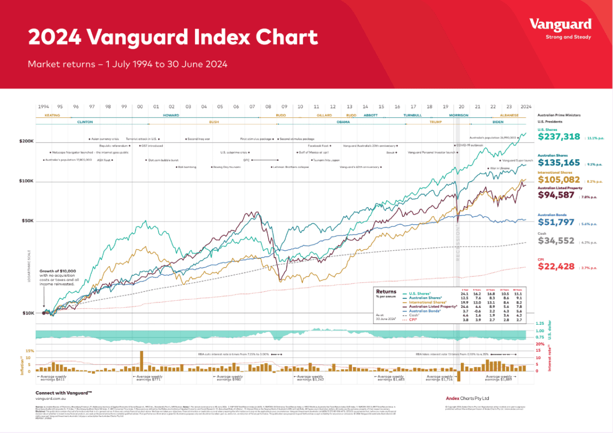
For the uninitiated, the Vanguard Index Chart shows the progress of a hypothetical $10,000, invested over 30 years, in different asset classes, but in shares in particular.
And it tells us a few things.
First, the highlights.
That hypothetical $10,000, invested on July 1, 1994 and held for 30 years would have turned into:
$237,000, if invested in US shares
$135,000, if invested in Australian shares
$105,000, if invested in International shares
$94,000, if invested in Australian listed property; and
$51,000, if invested in Australian bonds.
Left to compound in cash, it would have become $34,500.
(None of the above includes fees, brokerage, taxes etc., or the benefit of franking credits)
I will add here, just in case anyone is wondering, that neither I nor The Motley Fool have a commercial relationship with Vanguard. I just love the hell out of this chart for its ability to tell and to teach, and it's the one resource I reckon every investor should print out and keep somewhere!
Put another way, here's how your money would have multiplied, over three decades:
23.7x, if invested in US shares
13.5x, if invested in Australian shares
10.5x, if invested in International shares
9.4x, if invested in Australian listed property; and
5.1x, if invested in Australian bonds.
Want that annualised? Sure!
11.1% per annum, if invested in US shares
9.1% p.a., if invested in Australian shares
8.2% p.a., if invested in International shares
7.8% p.a., if invested in Australian listed property; and
5.6% p.a., if invested in Australian bonds.
I hope those numbers all impress you. They should.
They show us the awesome power of compounding, over time, when money is invested, then left alone, in quality assets.
They are, of course, historical numbers. There is no guarantee about the future.
And they continue a trend that goes a long, long way back. Not necessarily the same numbers, every year (in fact never the same, every year), but directionally, the lines are pretty similar.
And here's where the rubber hits the road: for all of the carry-on earlier this month, it's the long term picture that investors should be focussed on.
I don't know how many times the ASX, for example, fell 5% in a few days over the last 30 years. I'd wager it happened quite a bit.
There were also – as you can see – wars, terrorism, actual and prospective recessions, different parties in power, and some really impressive (in a bad way) market falls, including the dot com crash at the turn of the century, the GFC, and the COVID crash.
And yet?
And yet, the market still delivered those frankly stonking gains.
As Russell Crowe might have said, were he a financial advisor, rather than gladiator, "Are you not impressed?"
It's at this point, people start with the 'yeah, but's and the 'whatabout's.
If they're genuine questions, rather than just reasons to not listen, I'm all ears. Too often they're the latter, because it doesn't fit my interlocutor's worldview.
But also, most of the 'what ifs' are dealt with, specifically in the chart.
I mean, sure, there could be another Great Depression, meteor strike, or violent government overthrow. It's possible that every company on the stock market becomes suddenly and permanently unprofitable.
I offer you no guarantees.
Instead, I live my professional life in the world of probabilities. And, given more than a century of history, I think the most probable outcome is that the future is directionally like the past.
Humanity strives for improvement. Much (though obviously not all) of that is achieved through new solutions to old and new problems, wants and needs, and delivered through publicly listed companies.
Have we really reached the peak of humanity's progress? And if we haven't, isn't it likely that our listed companies get at least their share of the spoils of future gains?
Now, I'm not saying share markets will never fall. In fact, I'm saying exactly the opposite: I think it's incredibly likely that the next 30 years includes more than a couple of big, scary, gut-wrenching falls…
… just like the last 30.
But I think the market is likely to be meaningfully higher – probably somewhere around the historical average of 9% per annum, but perhaps more or less – in another 30 years.
A prediction? No.
But the sum total of my investable assets, outside my house, are invested in shares of Australian and US companies, because I think the past gives us a directional idea about the most likely future.
And that's why I love the Vanguard Index Chart.
It shows us that journey. "Here's one I prepared earlier", as the TV cooks might say.
It reminds us that, well, stuff happens.
Good stuff mostly, though that never gets the headlines and largely goes unnoticed.
Bad stuff sometimes, which does get the headlines, and tends to lead to nervousness and sometimes panic.
But overall? The direction of human progress is 'up and to the right'. The same is true, over more than 100 years, of the Australian and US stockmarkets.
And over the last 30, as the chart shows us.
So whenever the market takes a wobble, this is the chart I return to. To remind myself that despite – not in the absence of – fear, falls and foibles, the market has tended to go up.
And, in my view, will continue to do so for a long, long time yet.
Happy Vanguard Index Day to all who celebrate. And, this year and hereafter, I hope that's you, too.
Here it is!
Fool on!